
Building on the recent client win, we were asked to identify opportunities to enhance their website to elevate their online presence and drive user engagement.
RESULTS: Full Client Buy-in and Expanded Scope of Work
✳︎
RESULTS: Full Client Buy-in and Expanded Scope of Work ✳︎
My Role
Senior UX Designer and UX Strategy
My Role Overview
I led the UX strategy behind a research-driven redesign — from content audit and user journey mapping to IA restructure and wireframes — proposing a modernized site and driving stronger user engagement.
Project Timeline
6 weeks
Tools
Figma
Miro
FRBS's site holds critical financial services information, but the experience doesn’t match its importance.
Our goal was to fix that by rebuilding the IA and visual design around clarity and ease of use.
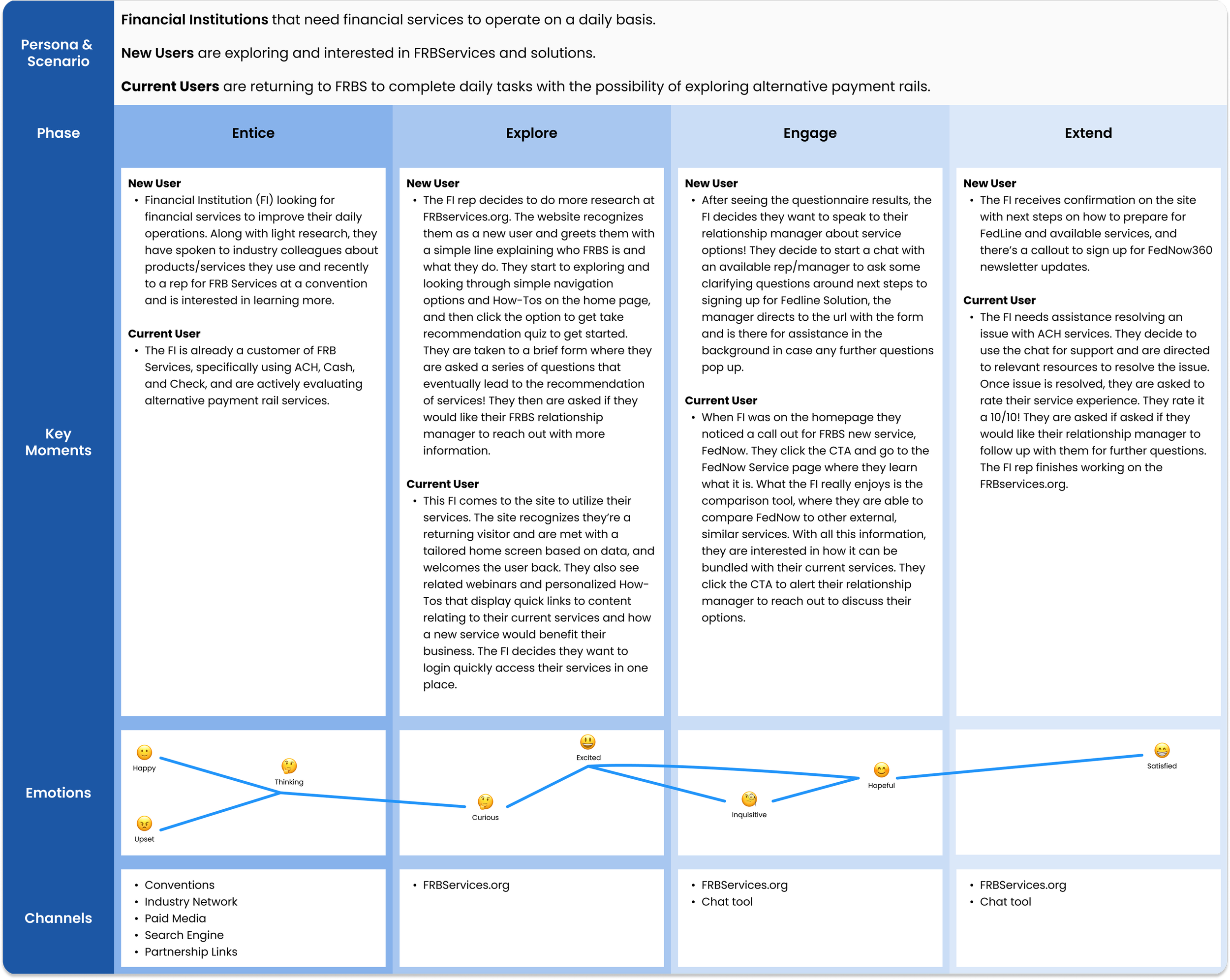
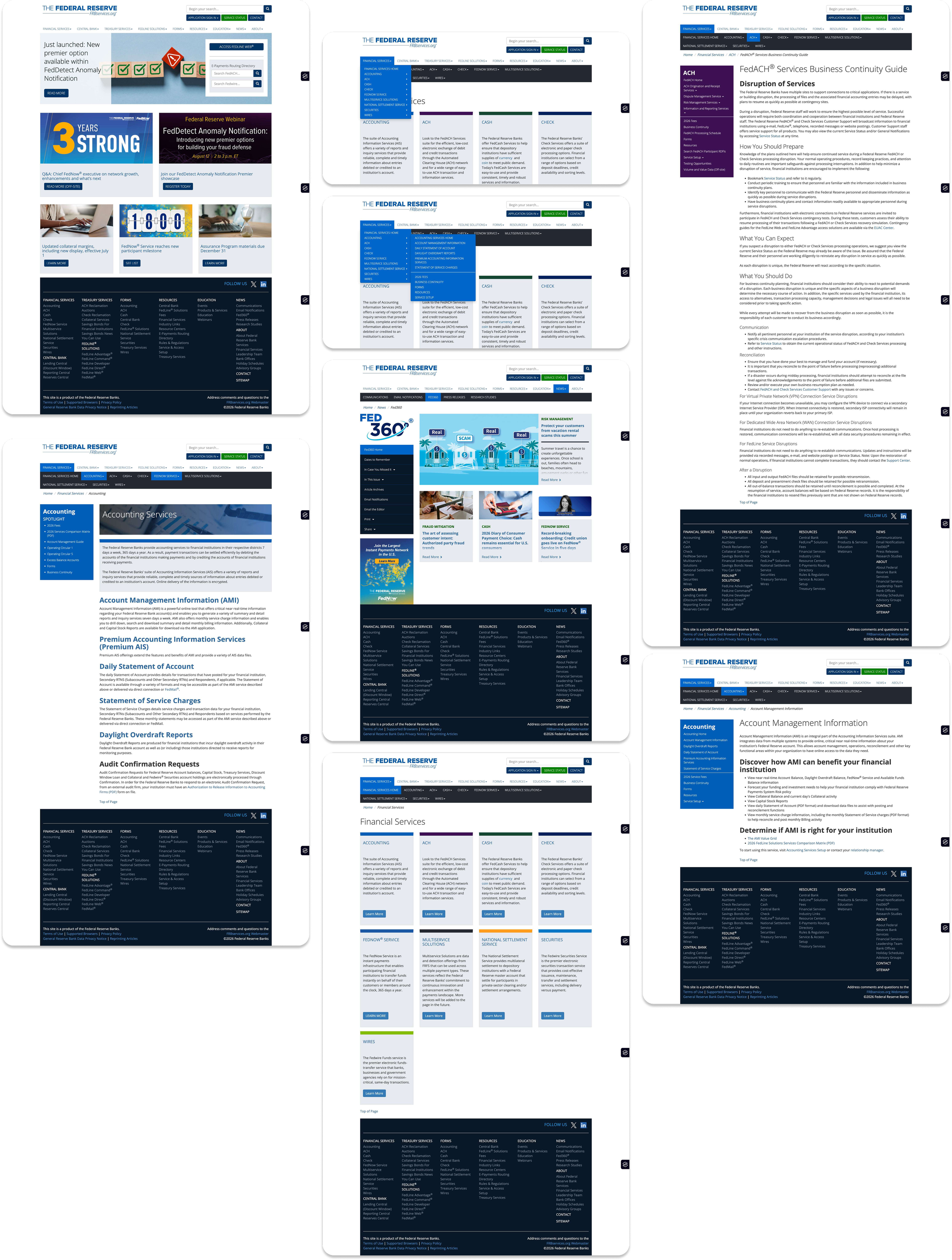
Our research began with a Screaming Frog crawl and a full content audit — and what it revealed there was no real journey for users, just an endless sprawl of unorganized pages with no clear path through them.
It ended with an updated ideal user journey.
The crawl and audit exposed a site that had grown page-by-page without a guiding structure — content sat disconnected, and users had no defined path to reach what they needed. We defined an ideal-state journey — a clear, intentional path grounded in what the research showed users actually needed to accomplish. This shift, from isolated pages to a mapped journey, became the foundation for the IA redesign that followed.
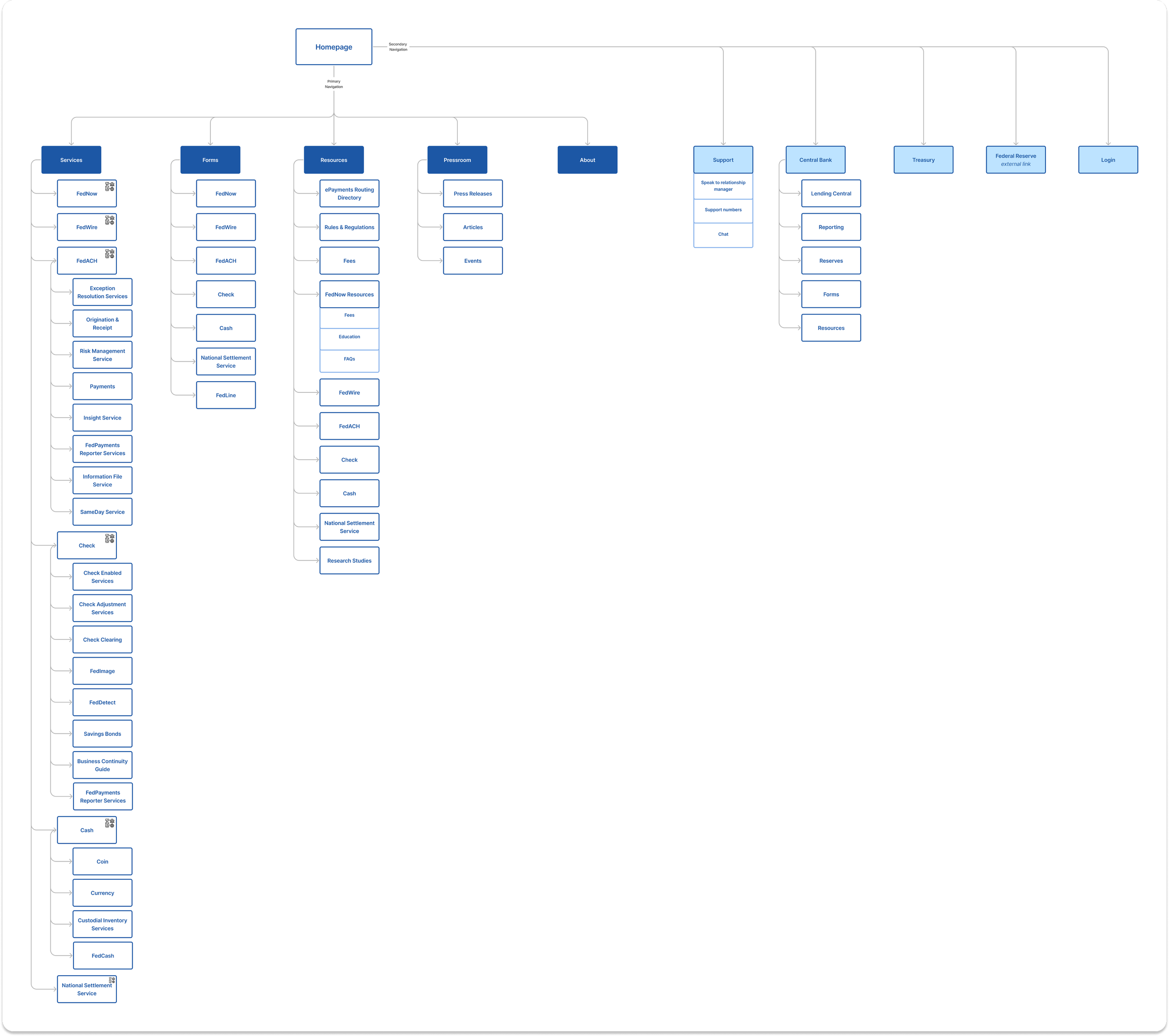
Leveraging the user journey and website audit findings, we designed an IA built around services. We condensed and eliminated content to allow users to intuitively move through FRBServices.
The current IA is unorganized with pages added over time as the business grew.
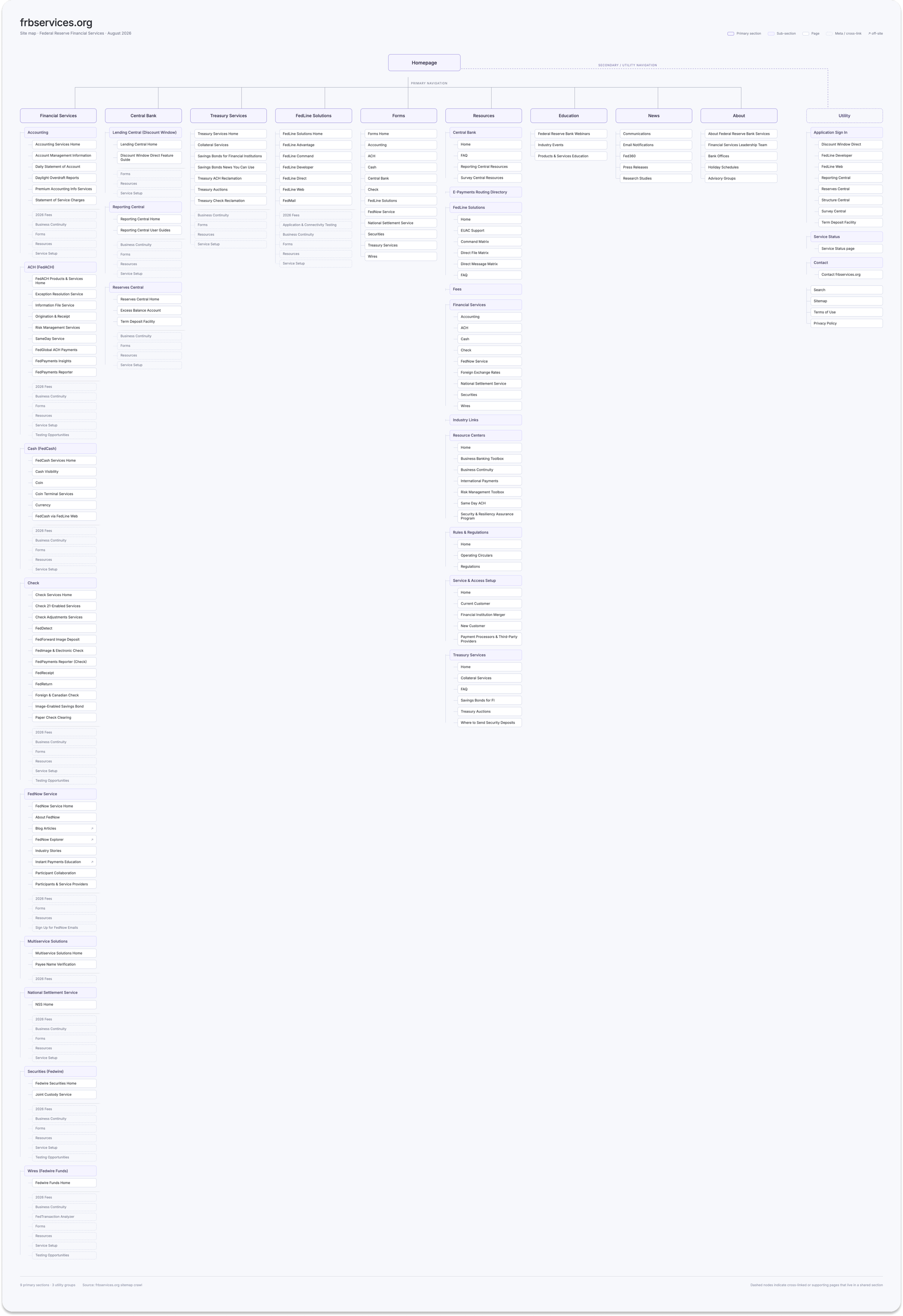
The new IA provides a path for users to search by services and bring forward highly visited pages that were previously buried.
We replaced a maze of overlapping navigations with a single, intuitive structure. The current site offered no real IA — just layered menus that left users unsure where they were or how to move forward. Our new IA eliminates redundant sub-navigation and organizes every section around clarity, giving users one clear path through the site.
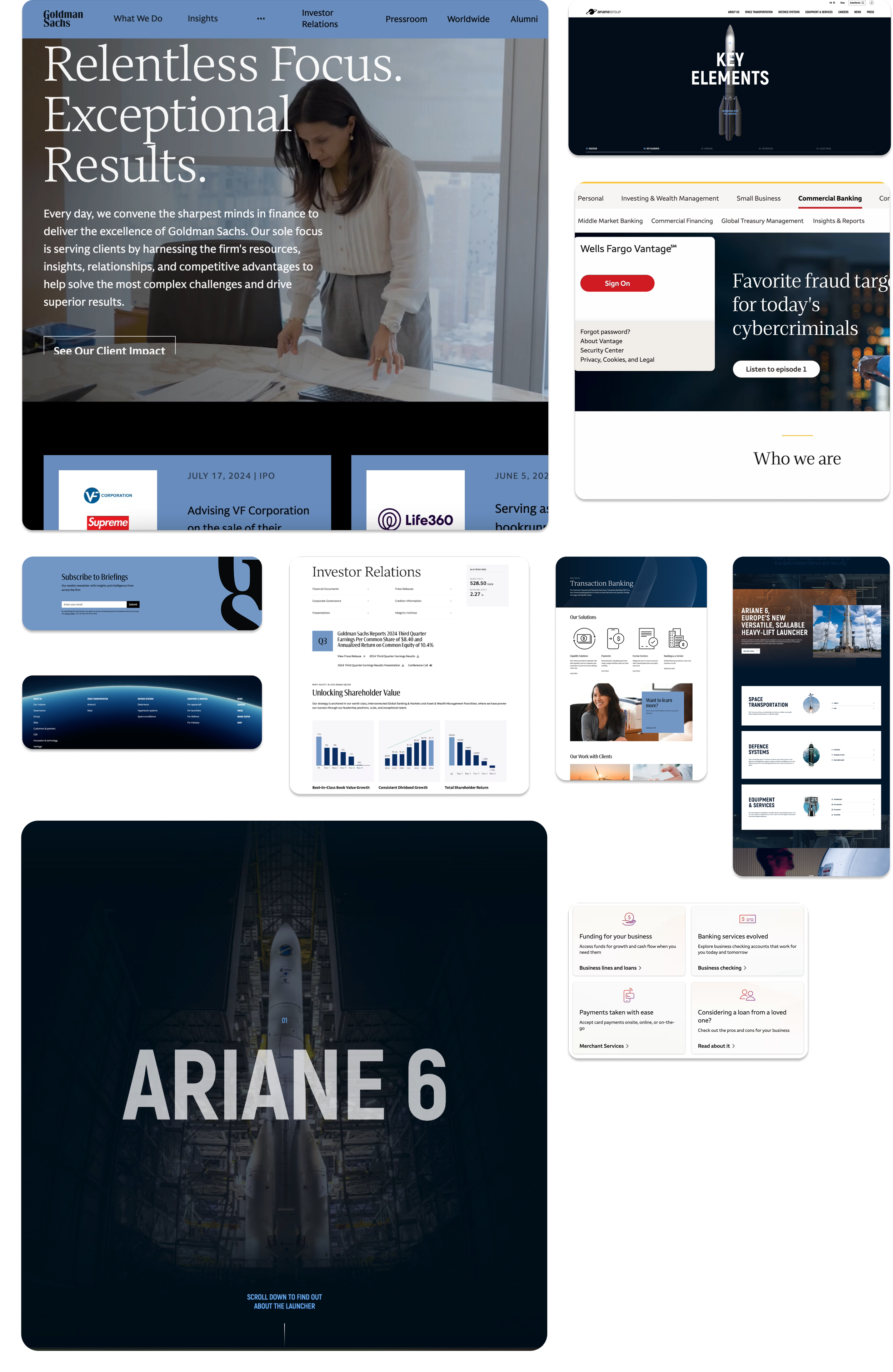
Moving into design exploration, we led with these principles…

Communicate with Clarity
Showcasing content strategy that embodies the Federal Reserve's voice – clear, informative, and accessible.

Elevate Usability
Modernize look and feel, navigation, and search design to increase engagement.
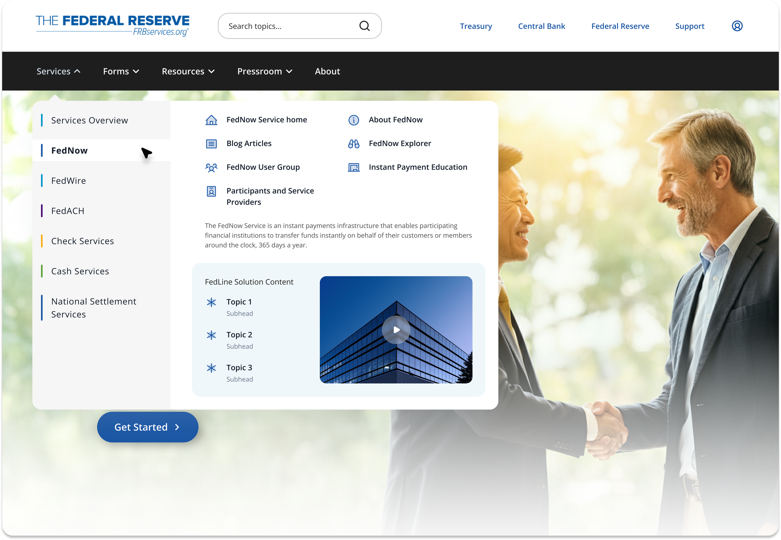
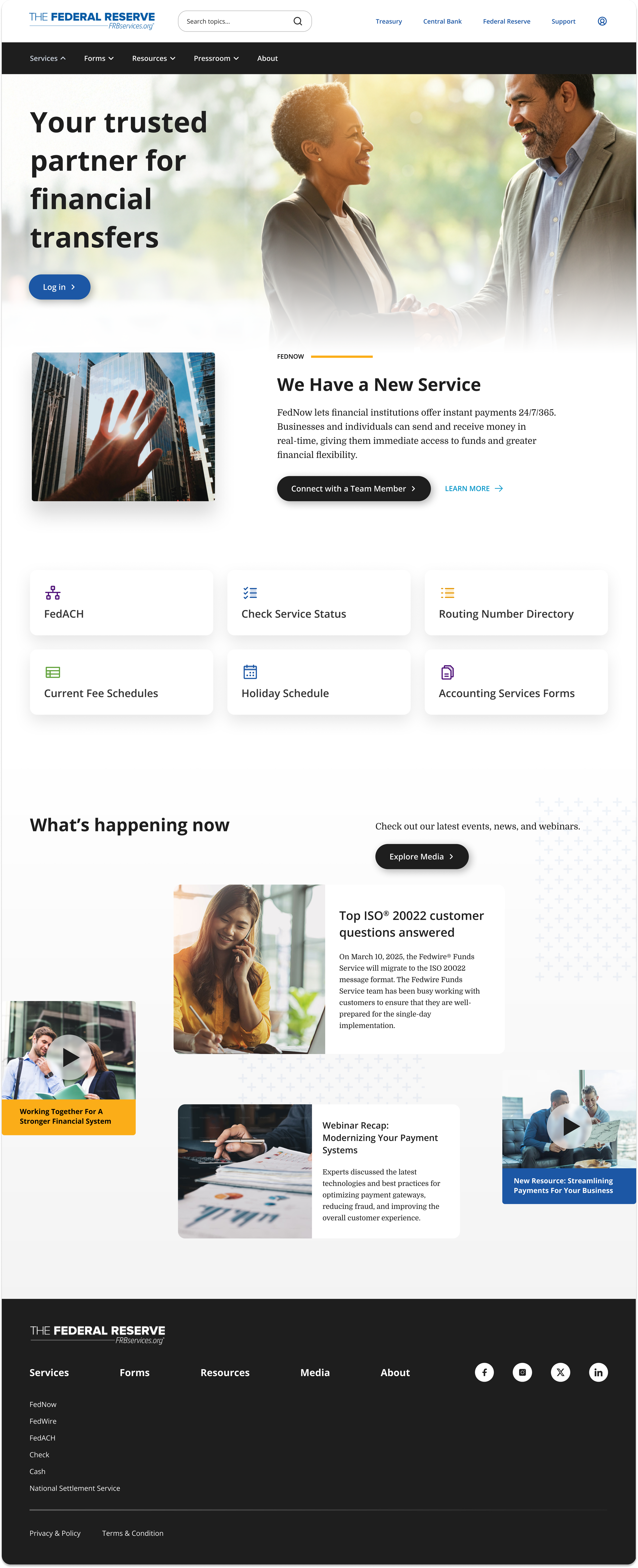
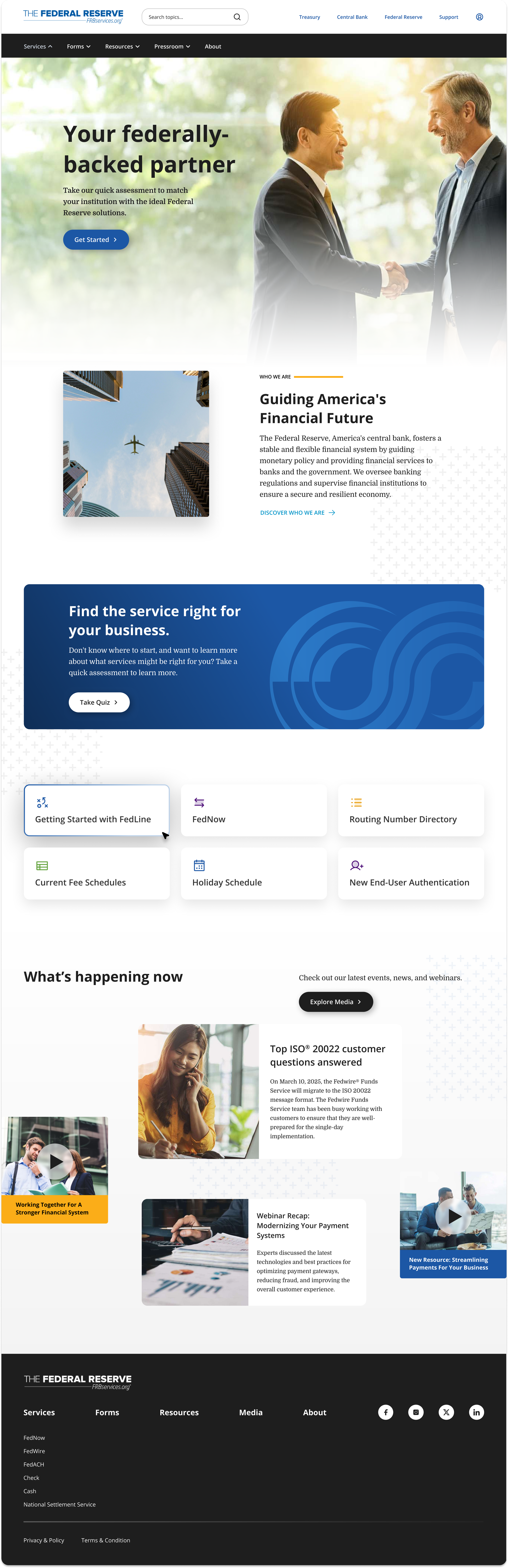
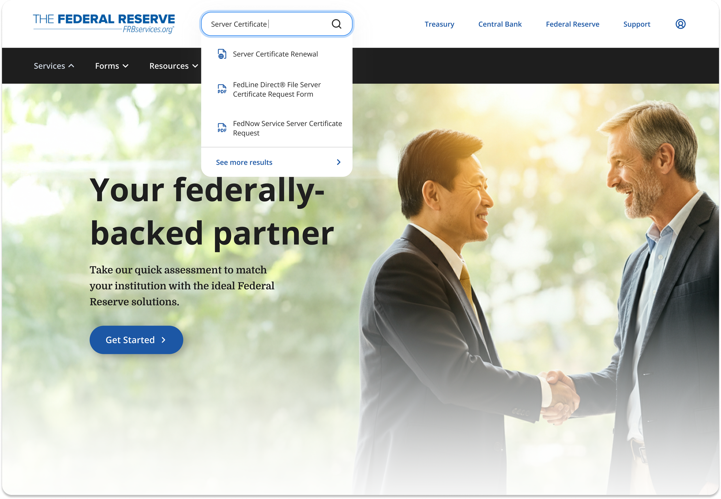
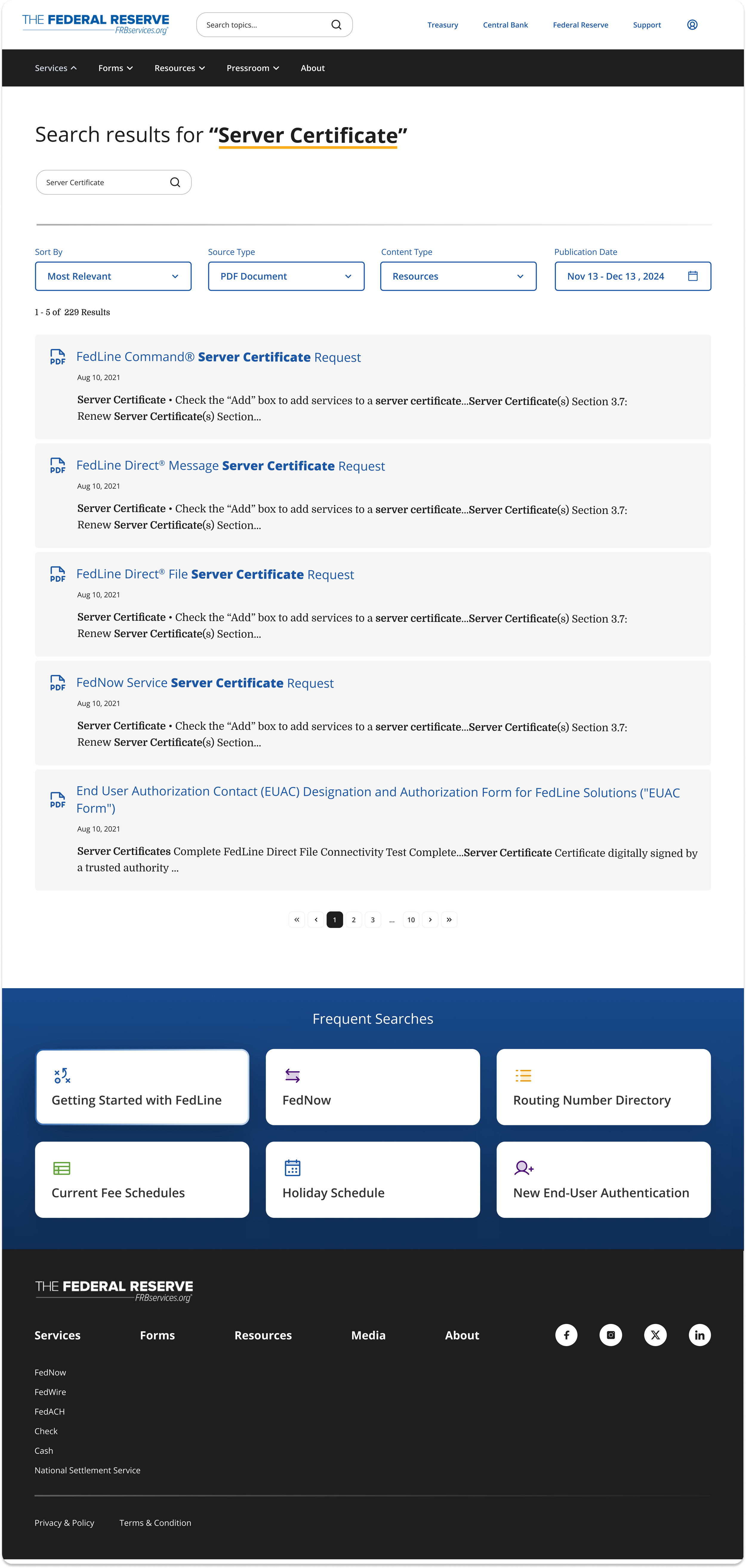
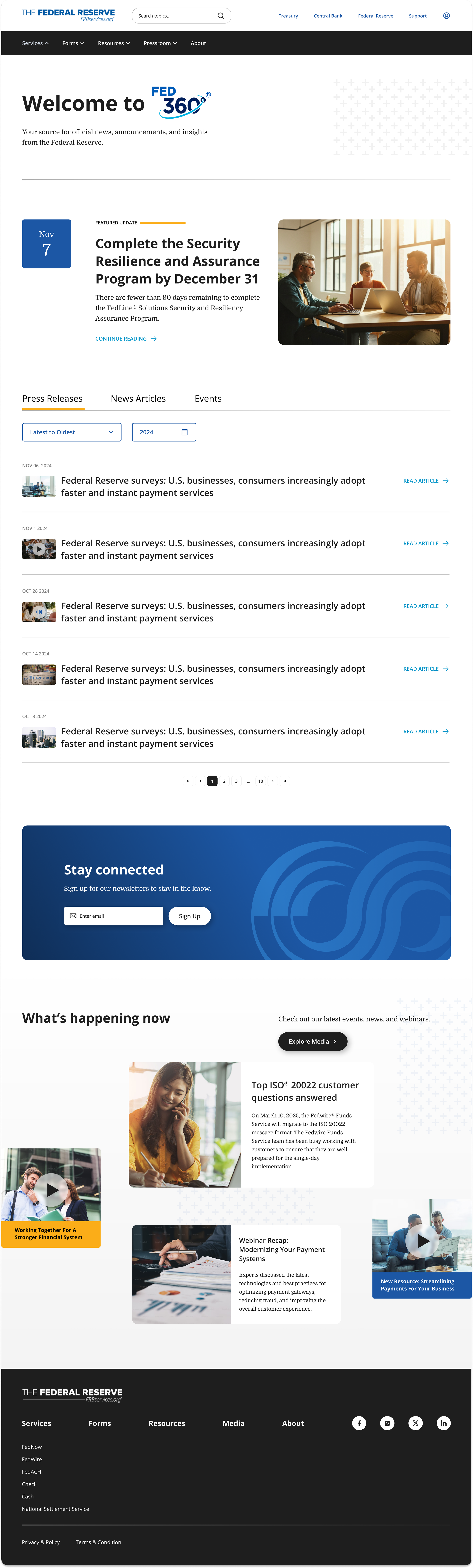
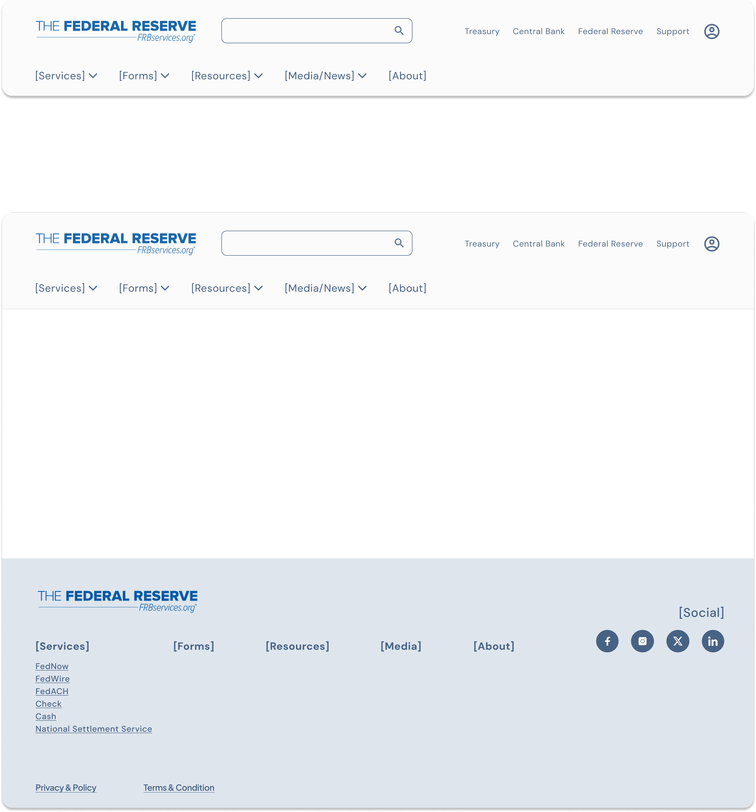
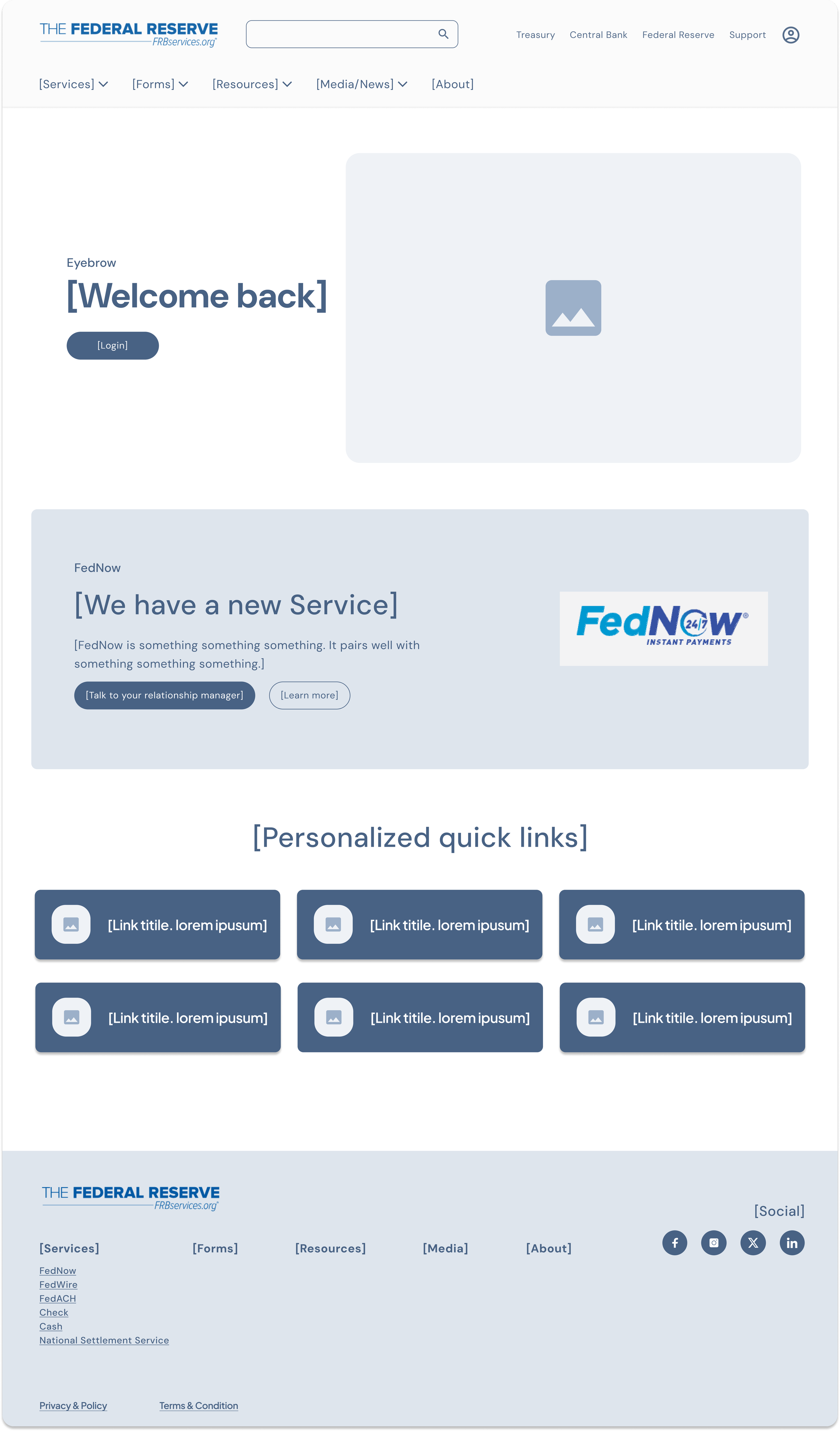
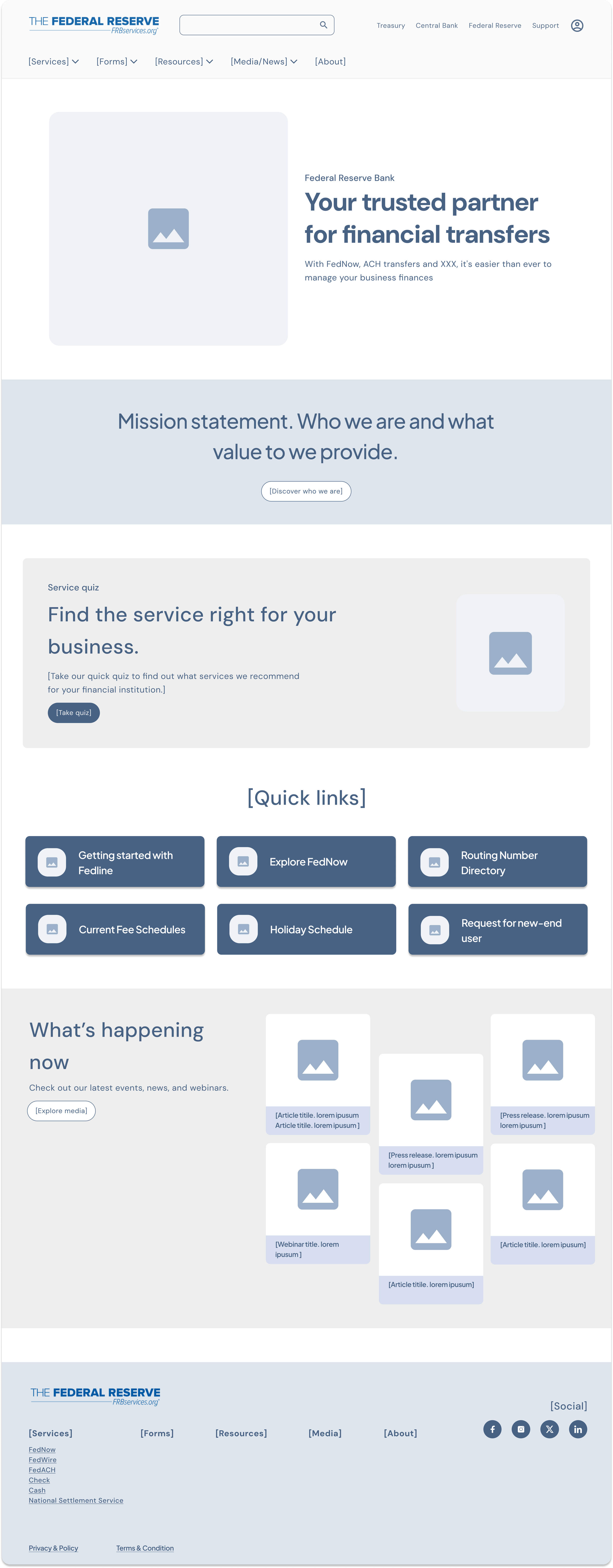
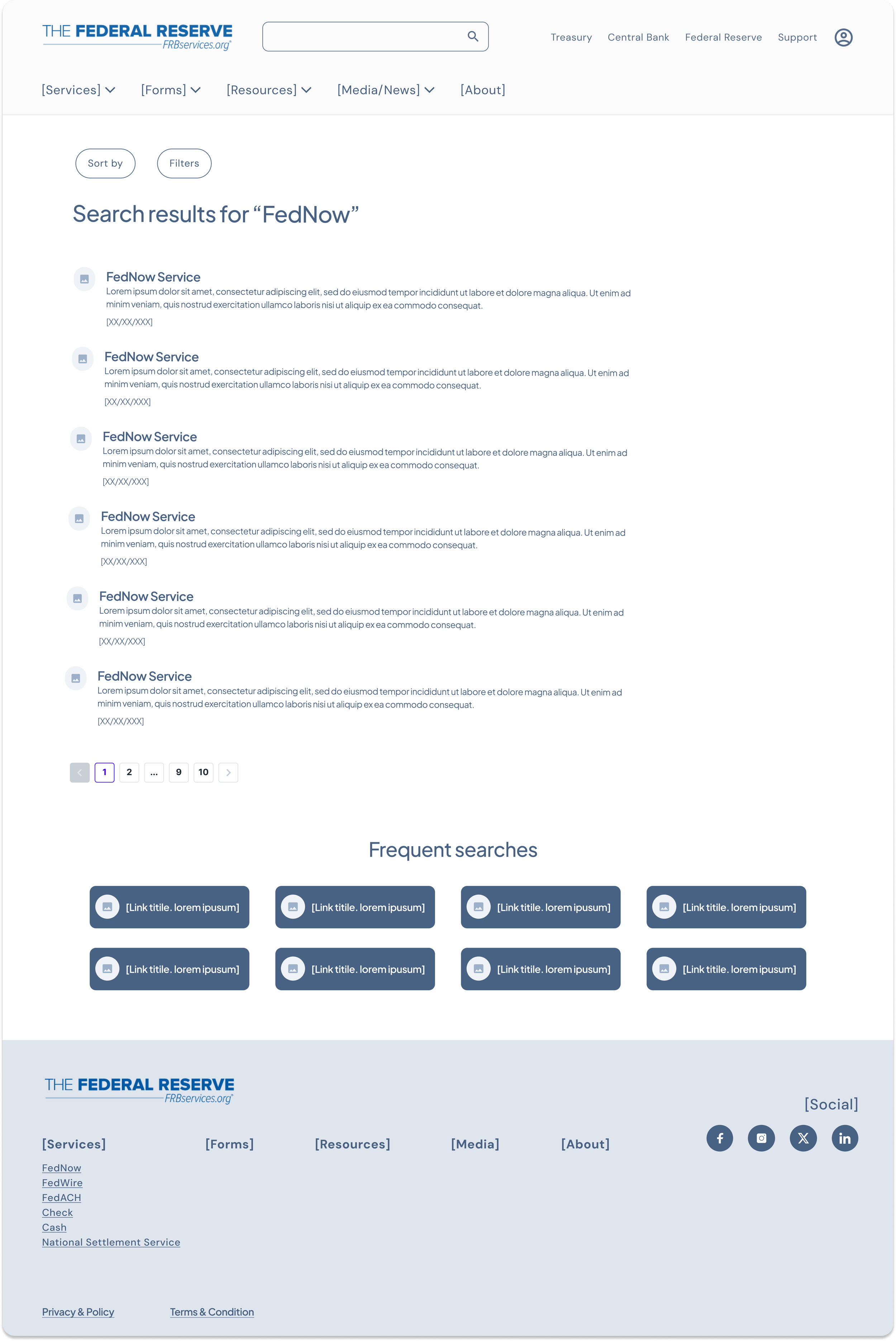
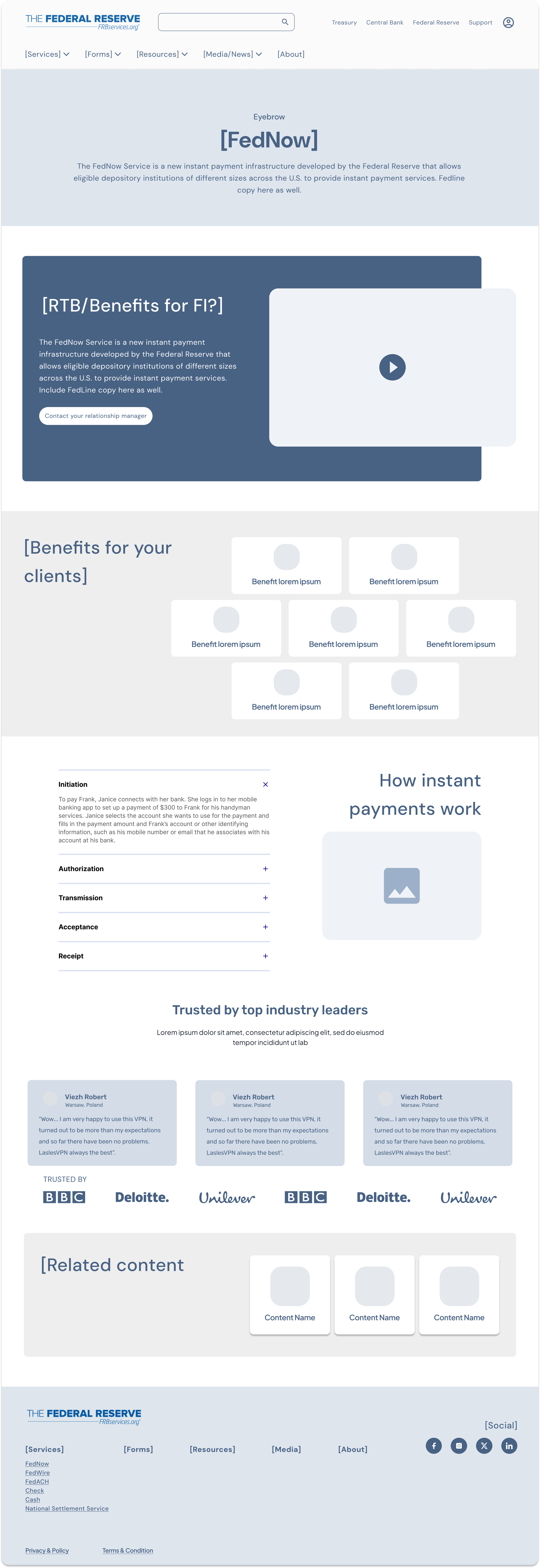
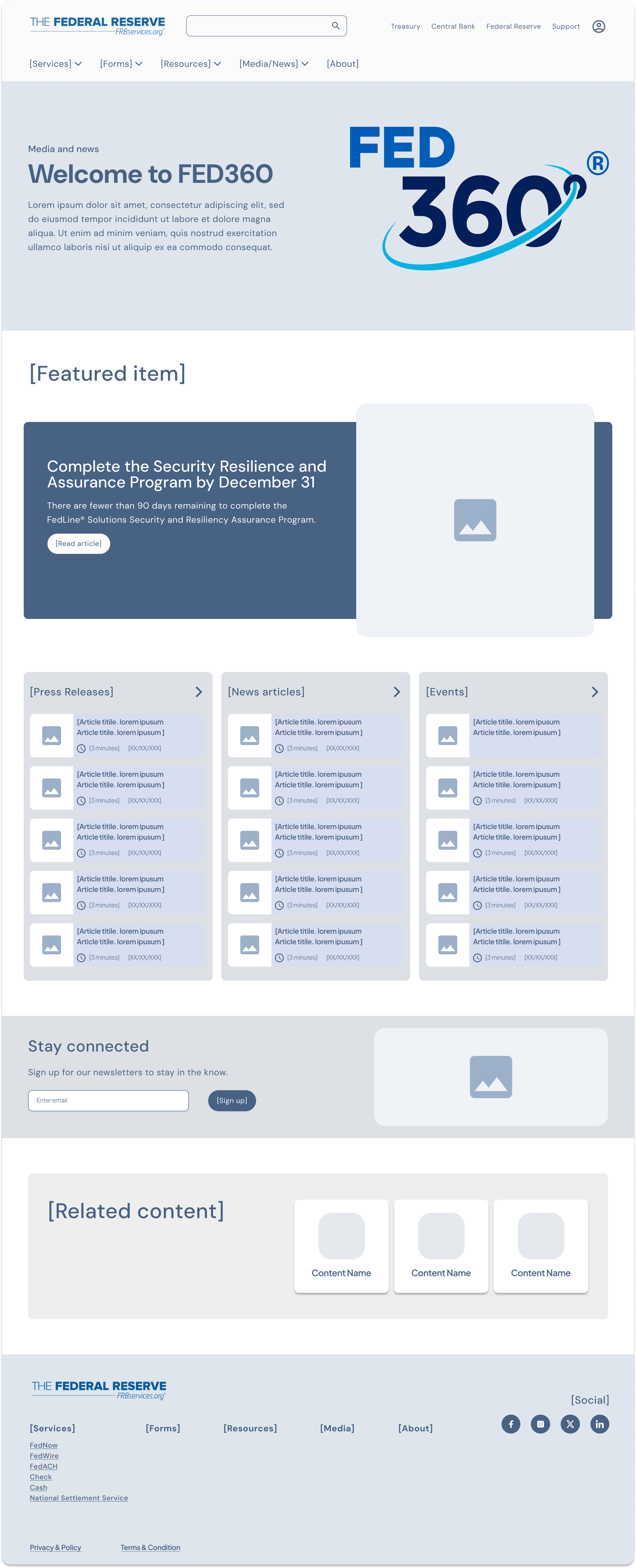
We wireframed and designed select, high traffic pages to spotlight our strategy and key experiences (Search) that would benefit the user’s experience.
-
![]()
Navigation
-
![]()
Home - Light Authentication
-
![]()
Home - Unauthenticated
-
![]()
Search Results
-
![]()
FedNow
-
![]()
Fed360
-
![]()
Navigation
-
![]()
Home - Light Authentication
-
![]()
Home - Unauthenticated
-
![]()
Search Bar
-
![]()
Search Results
-
![]()
Fed360